CASA0005 seminar 2
1
Introduction
2
Recommended resources
2.1
Resouces for the ggplot2 package
2.2
Resouces for graphs or data visualization in academic research
2.3
How to find more useful resources
3
Recap
4
Getting started
4.1
Installing packages
4.2
Loading packages
4.3
Dataset
5
Graphics with ggplot2
5.1
Basic components of a ggplot2 Plot
5.2
Building a simple ggplot plot
5.2.1
Make sure your datasets are data frames
5.2.2
Plot background and set the x and y axis
5.2.3
Add a layer
5.2.4
Color the point
5.2.5
Add a linear regression line
5.2.6
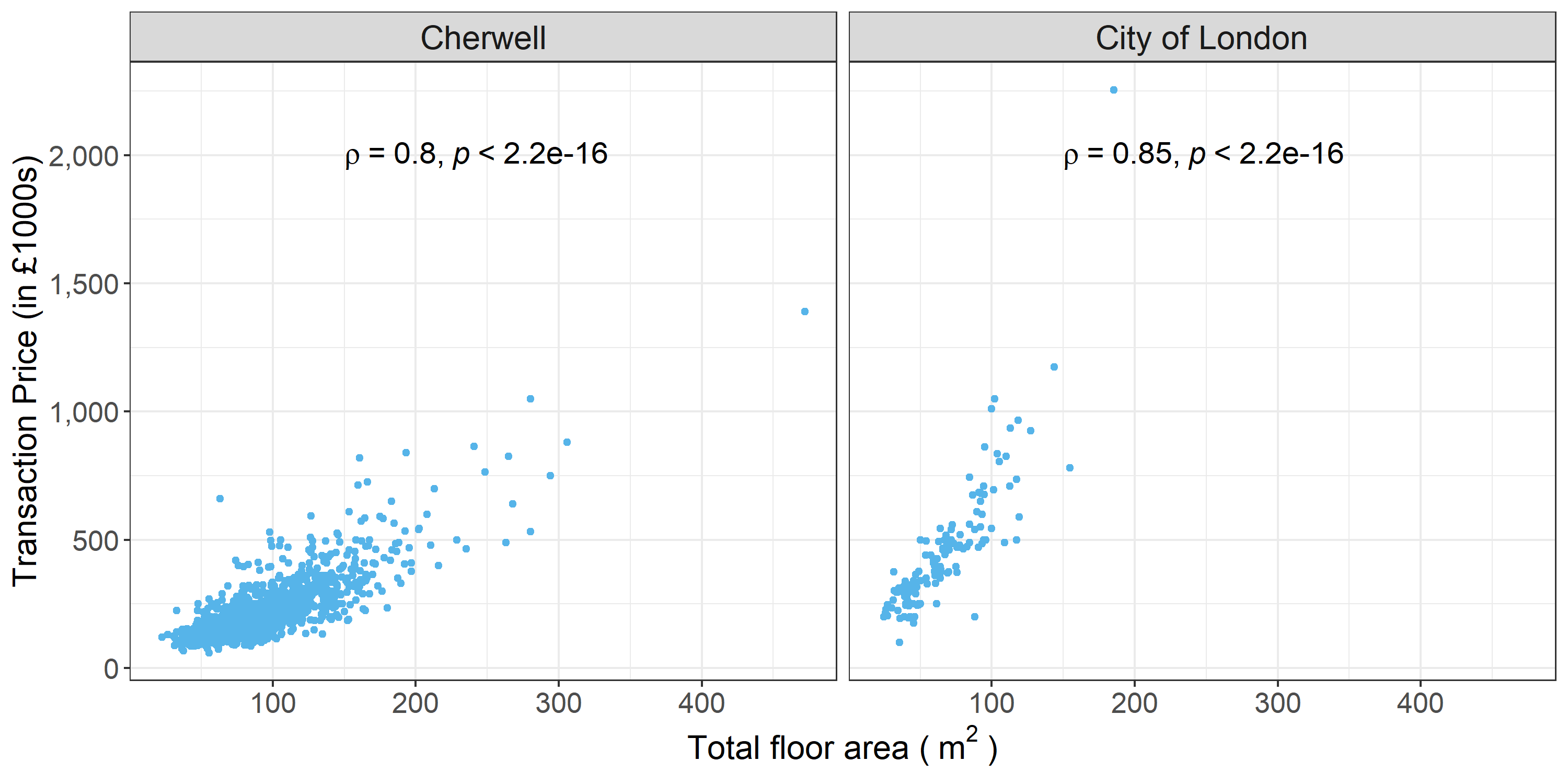
Split a single plot into many related plots
5.3
Customizing the graph
5.3.1
Change the point colour
5.3.2
Change the point size
5.3.3
Change the point shape
5.3.4
Modify fitted regression lines
5.3.5
Change the axis titles
5.3.6
Add axis labels and units
5.3.7
Add in title
5.3.8
Change themes
5.3.9
Change the font size
5.3.10
Add in the Pearson correlation coefficient result in the plot
5.4
Saving graphs
5.5
Extensions
6
Challenges
6.1
Challenge 1: reorder the items in legend
6.2
Challenge 2: Manualy setting the colour of the line and point
7
Answer
Q & A
Published with bookdown
Customizing ggplot2 plots in R for scientific research
Customizing ggplot2 plots in R for scientific research
Bin Chi
25/11/2020